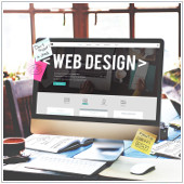
 A good looking page will determine how many people trust a website. This is especially true for small business owners trying to establish their company’s identity online. But with so many similar businesses to compete with, how can you stand out from the crowd? This is why it’s even more important to stay on top of web design trends to attract more visitors. Consider using some of these web design ideas on your own website to stay ahead of the competition.
Scrolling
Scrolling is a convenient method for traversing a website. Instead of navigating through confusing menus and drop-down tabs, a scrolling one-page site has a cleaner look and is usually more intuitive for the user. This web design style is definitely more important today, now that people have grown more accustomed to mobile web browsing.
You also have to decide how far visitors will have to scroll to get to know your company. While a long scrolling page gives you more white space and content to work with, a short scrolling page can quickly convey your company’s message and encourages call to actions. The next time you revamp your company website, consider the appropriate scrolling element for your page.
Flat design
To achieve an optimal viewing experience for users, many companies adopted a flat design for their websites. The flat design style replaces the elements that gives an illusion of depth, like shadows and textures, with minimalist typography and colors. For example, Google employed this style to get content to viewers more efficiently. The company added flat design colors and used a sans-serif font. This allowed the logo to load faster and made it was easier to read as well.
Animations
One way businesses have been setting themselves apart from others is by including customized animations to their pages. Now this doesn’t mean you should overload your site with flashy effects that take forever to load. If you want to use animations on your site, give it a subtle twist. For instance, Slack’s loading animation features their logo.
Additionally, animations can be used to increase user interaction and engagement. Hover animations will allow your users to mouse over your content and get an immediate response without having to move between pages. Slideshows on your homepage can also showcase what your company is about without throwing too much information at the audience. When deciding to add an animation to your page, figure out how a specific effect can enhance the user experience while showcasing your business.
Full-screen forms
More websites and apps are using full-screen forms to increase user interaction. Rather than being redirected to another page when your visitors decide to register or login to a website, you are welcomed by a full-screen form without leaving the home page. This is also especially useful for mobile users since they are less likely to misclick sections of the form.
Customized photos
The next time you want to use photographs to highlight your company, forget about using stock photos. Businesses who exhibit their own photography on their homepages look more personal and stand out from the competition.
While these trends are popular at the moment, don’t blindly adopt them all because it will end up looking very messy. The best way to approach these web design trends is by making sure that the design fits your target audience. You won’t exactly have mouse over animations for a website that doesn’t have very many images. Use the trends that are best for your company.
If you want to learn more about current web design trends, give us a call.


